
Responsive Website Builder
Build a responsive website in minutes for free with AI. Write in plain English or tap buttons to create your website.


How to Use the Responsive Website Builder
Responsive Website Builder Example
Built with Replit.
Build your vision in minutes for free without writing a single line of code.
Prompting the Responsive Website Builder
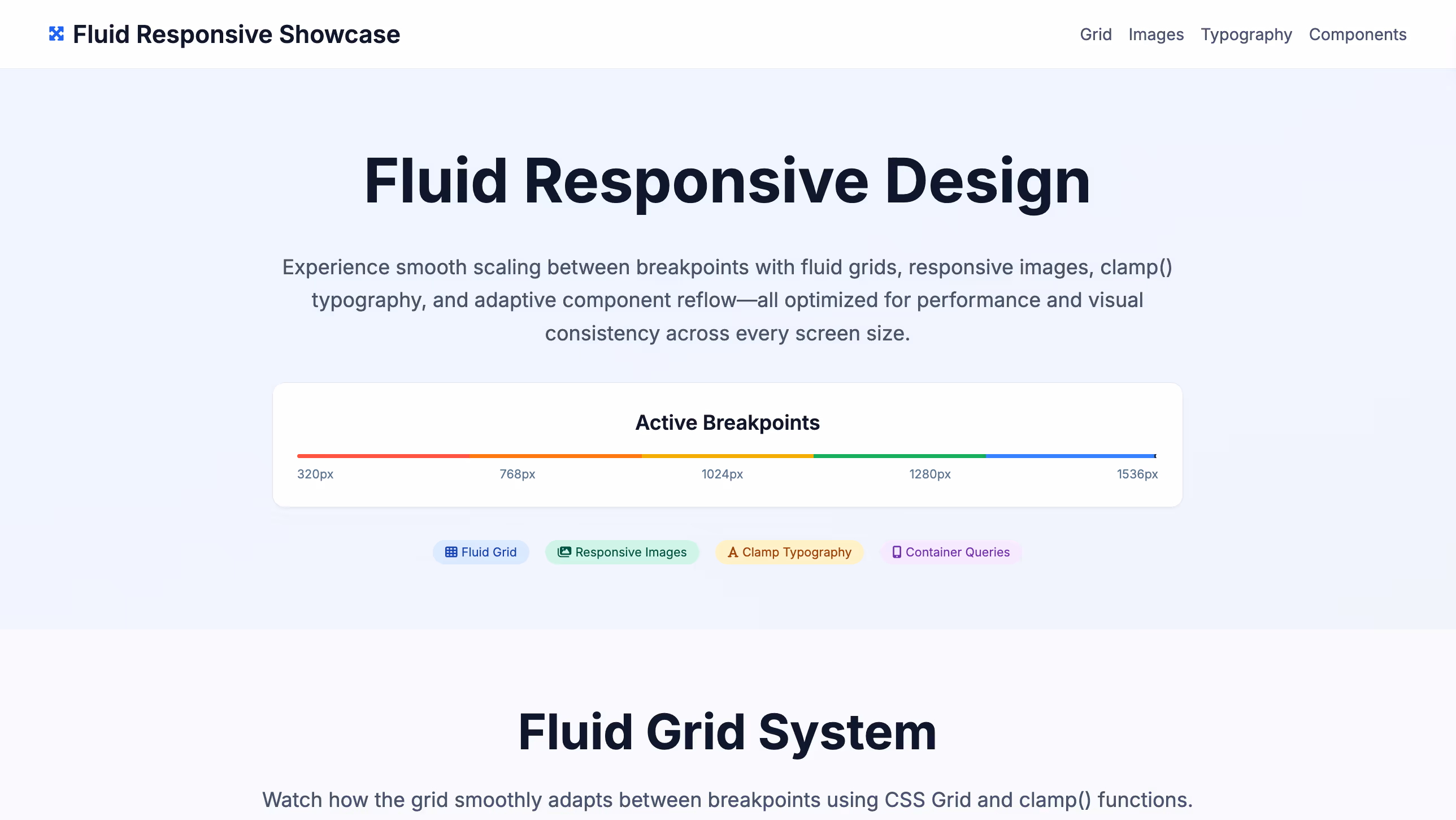
Build a fluid, responsive site using a percentage-based grid for columns, flexible media (max-width: 100% with intrinsic aspect ratios), fluid typography sized with viewport units, and viewport spacing with relative units (vw, em) for proportional white space.
Create an adaptive website that uses server-side detection (user-agent/RESS) to select distinct breakpoint layouts (320, 768, 1024) with pixel-precise templates, loads device-specific assets (images, fonts, scripts) per breakpoint for performance and fidelity, and renders component variants tuned to each device context and content density.
Build a fluid-responsive site with a fluid grid that scales smoothly between defined breakpoints, responsive images using srcset and sizes, clamp() typography that scales within sensible min/max bounds, and adaptive shifts where components reflow fluidly then refine with targeted breakpoint rules to avoid layout thrash and stay polished across widths.
Build a responsive site using mobile-first CSS with min-width enhancements, touch-optimized controls and gestures, progressive enhancement for core-to-advanced features, and fully accessible navigation (keyboard, screen reader, reduced-motion) that adapts to screen size.
Top Responsive Website Features by Type
Percentage Grid
Layout columns use percentage widths to scale smoothly with any viewport. This ensures consistent proportions and eliminates awkward jumps between sizes.
Flexible Media
Images and videos scale via max-width
Fluid Typography
Text scales with viewport units to maintain readable rhythm across devices. It avoids abrupt size changes while preserving hierarchy.
Viewport Spacing
Margins and paddings use relative units like vw and em for proportional white space. This maintains balance and flow as the layout expands or contracts.
Breakpoint Layouts
Distinct templates are served for specific width ranges (e.g., 320, 768, 1024). This allows pixel-precise control for each device class.
Device Assets
Images, fonts, and scripts are tailored per breakpoint or device profile. It improves performance and visual fidelity on each target.
Server Detection
User-agent or RESS strategies select the best layout on the server. This reduces client work and speeds up first render on constrained devices.
Component Variants
Key widgets have breakpoint-specific versions tuned for context. This ensures usability by adapting controls and content density per device.
Fluid + Breakpoints
A fluid grid scales continuously between defined breakpoints. It blends smooth resizing with strategic snap points for control where needed.
Responsive Images
Srcset and sizes deliver right-sized images as the layout fluidly changes. This preserves clarity while minimizing bandwidth across widths.
Clamp Typography
Font sizes use clamp() to fluidly scale within sensible min/max bounds. It prevents extremes while maintaining readable, proportionate text.
Adaptive Shifts
Components reflow fluidly, then refine at breakpoints with targeted rules. This avoids layout thrash and provides polish at key widths.
Mobile-First CSS
Base styles target small screens, with progressive enhancements via min-width queries. This ensures fast defaults and scales up gracefully.
Touch Controls
Interactive targets and gestures are optimized for fingers and pointers. It boosts usability across phones, tablets, and hybrids.
Progressive Enhancement
Core content works without advanced features, adding capabilities as supported. This improves resilience across browsers and networks.
Accessible Navigation
Keyboard, screen reader, and reduced-motion friendly menus adapt to screen size. It ensures everyone can navigate regardless of device or ability.
The Responsive Website of Your Dreams
FAQ about the Responsive Website Builder
How to build a responsive website?
To build a responsive website, use flexible layouts and CSS media queries so your site adapts to different screen sizes. A responsive site provides a good user experience on any device, from desktops to mobile phones, by adjusting its layout automatically.
On Replit, you can start with an HTML/CSS/JS template. Edit the files in the workspace to build your site's structure and style. To implement responsiveness, you can ask Agent3 to write the code for you. For instance, you could prompt it with: "Add CSS media queries to make this layout stack vertically on screens smaller than 600px." Agent3 can also help fix layout errors or suggest improvements to your code. Once your site is ready, you can deploy it directly from your Repl.
What features should a responsive website include?
A responsive website must include a fluid grid, flexible images, and CSS media queries. These features allow the site to adapt its layout for optimal viewing on any device, from desktops to smartphones.
A fluid grid uses relative units, like percentages, so the layout can stretch or shrink. Flexible images resize to fit their container, preventing distortion. Media queries are CSS rules that apply different styles based on screen characteristics, such as width, allowing for major layout adjustments between devices.
In Replit, you can create a responsive site by editing HTML and CSS files directly. You can start with a responsive template or ask Agent3 to generate one. For specific tasks, you can prompt Agent3 to "make all images flexible" or "add a media query for screens under 768px." If your layout breaks on certain devices, Agent3 can also help debug the CSS.
How do I design a professional-looking responsive website?
To design a professional, responsive website, use a flexible layout that adapts to different screen sizes. Start with a responsive template and customize its code. Responsive design ensures your site looks and works well on any device, from desktops to mobile phones, by using fluid grids and CSS media queries to adjust the layout automatically.
In Replit, begin with an HTML/CSS/JS template and edit the files in the workspace. For specific adjustments, ask Agent3 to modify your code. For instance, you can prompt it to "make the navigation bar collapse on mobile screens" or "fix layout issues on smaller devices." This lets you build and test a responsive design by directly editing the code with automated assistance.
What is the best way to optimize a responsive website for search engines?
The best way to optimize a responsive website for search engines is to use a single URL and the same HTML for all devices, allowing the design to adapt to different screen sizes.
Search engines prioritize mobile-friendly websites because they offer a better user experience. Responsive design helps by using one codebase that adjusts to various devices, which simplifies crawling and indexing for search engines since they only need to manage one version of your site.
In Replit, you can edit your HTML and CSS files directly to ensure they are responsive. A critical first step is adding the viewport meta tag to your HTML file: <meta name="viewport" content="width=device-width, initial-scale=1.0">. If you need help making your layout adaptive or fixing display errors on mobile, you can ask Agent3 to modify your code. For example, you can prompt it to "make my CSS responsive" or "fix elements that break the layout on small screens." Once your site is optimized, you can deploy it directly from the workspace.
How can I customize the layout of my responsive website?
You customize your responsive website's layout by editing its HTML and CSS files.
A website's layout and responsiveness are controlled by its CSS code. This code uses rules, such as media queries, to adapt the design for different screen sizes, from mobile devices to desktops.
In your workspace, you can directly edit the HTML and CSS files to change your site’s structure and appearance. If you need assistance, you can ask Agent3 to write or modify the code for you. For example, you could ask it to "change this layout to a two-column grid on desktop" or to fix responsive design issues. This allows you to customize your layout by working directly with the project's code.